Hero image
What is a hero image?
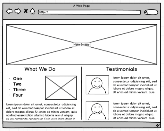
A hero image is a website design term used to describe an oversized banner image at the top of a website. Sometimes called a “hero header”, it serves as a user’s first glimpse of your company and offering because of its prominent placement towards the top of a webpage that usually extends full-width.

Source: Balsamiq
In addition to a high-resolution graphic, a hero image can contain your company’s unique selling point (USP) and a conversion goal, such as a signup form or button to begin shopping. A recent web design trend has been to use videos and animations for the hero image rather than static photos.
Why use a hero image?
A hero image, usually a high-quality photo or video, can be a good way to add a personal touch that immediately builds credibility and trust for your brand. Because people are highly visual, having high-quality, fullscreen imagery at the top of your page can help create a positive first impression.
A hero image can also direct users towards a desired link or call-to-action, or present your business’ value proposition at the top of the webpage. Hero images on media sites and blogs can also be used to catch the visitors' attention, and draw them into reading the article on the page.
Two things to watch out for when using hero images
There are a couple of things to be aware of when considering whether or not you want to use hero images on your website.
- Be wary of using large images for your hero images, as they may affect loading times, especially on mobile devices. Based on research done at Google, it’s been shown that increasing page load speeds from 0.4 to 0.9 seconds can reduce traffic by 20%. The effectiveness of hero images is lost if they take too long for the user to load. Ensure that your large banner image and video sizes are optimized and that they are hosted on a fast CDN so that they don’t slow down the load time of your page.
- Ask yourself whether or not the image you’ve selected actually adds value. Although using stock images as your featured image could initially be a cheap and quick solution, many times stock photos are cliché and unoriginal. The perfect hero image is supposed to complement your product images and core offering -- that’s very hard to achieve with stock images.
Hero image examples
Below are some examples of hero image designs from a variety of companies and industries.
As you can see, companies employ a number of different ways to direct customers towards conversion goals: inserting a form or a prominent CTA and button. It’s noteworthy to point out that sometimes the navigation bar is layered on top of the hero image.

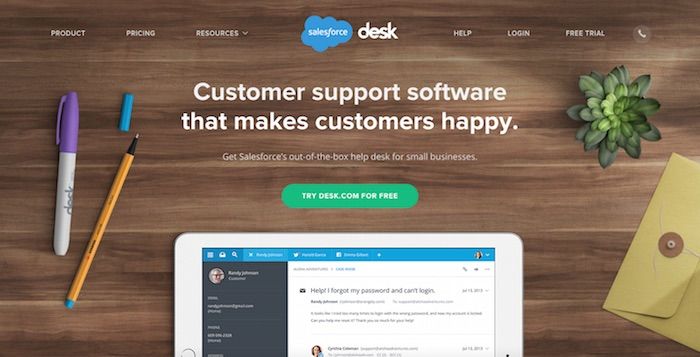
Desk (a B2B company) features a hero image on their homepage that includes a unique selling point and a form capturing customer information overlaid on top. The image of the desk reinforces the product name, and is clean and pleasing to the eye.

Spreadshirt (an ecommerce, print-on-demand t-shirt company) clearly outlines the company's value proposition in its hero image, and features two CTAs directing users towards their main functionality.

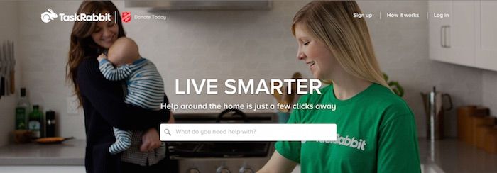
TaskRabbit (a company that provides on-demand help for errands) features a hero image with a mother with a newborn that visually communicates the value of the service. The hero image is also overlayed with the company's tagline and a CTA to search the site for help in your area.

Trunk Club clearly communicates their value proposition in their hero image and also includes a CTA. The image itself also conveys the services that Trunk Club offers.

Discovery features an animated hero image that directs the user to a video when it's clicked on. All of Discovery's pages and articles also feature luscious hero images that showcase the company's high-quality photography.

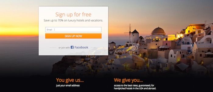
Secret Escapes (a travel deals company) features a CTA front-and-center in their hero image, as well as their value proposition. The image that they use also demonstrates examples of the travel destinations that they offer.
How to test different hero images using A/B testing
Because hero images have prominent placing on your website, it’s important to test out different images to determine which ones drive your conversion objectives, whether it’s reading an article or clicking on a CTA to making a purchase on your site.
A/B testing is a method of testing websites where 50% of your traffic is shown the original version of your page, and 50% are shown the new variation. By showing a random sample of your visitors different versions of your page, you can use data to determine which version of your page converts better.
If a challenger page doesn’t surpass an original page, you can always test new hypotheses, with variations in imagery, copy and CTA. You can also personalize your experiences by showing different segments of your visitors different hero images.
By continuously testing different images you can improve your conversion rates and website experience over time.
Hero image test ideas
Some ideas for optimizing hero images include:
- Testing the impact of a still image versus a moving image: There could be value in discovering whether users find your visuals engaging, aesthetically pleasing or informative, or if they find them distracting. Testing a still graphic against a moving graphic, such as a .gif or HTML5 visual could provide insights to your users' preferences.
- Testing the impact of an interactive play video, or an auto play video: It’s becoming more and more common online to hear embedded audio playing without having to activate it. It’s useful for sites that use video messaging to measure the importance of video content by testing whether users are clicking to activate the content, or if playing video automatically is the way to go.
- Testing the value proposition of the hero: Do different images create different emotions in your users and cause them to behave differently on your site?
- Testing the object focus of the hero: Does the main subject of your image create a positive feeling for users that generates actions that contribute to the end business conversion goal? Or is it off-putting?
There are many questions surrounding hero images that are worth investigating. Because hero images are the first thing users see, it’s an important area to test.


